Typography in packaging design is more than just choosing a font; it’s a powerful tool that communicates a brand’s identity, values, and message. The right typography can attract customers, convey important information, and create a memorable brand experience. This article delves into the role of typography in packaging design, exploring how it helps communicate brand identity and enhances the overall packaging appeal.
Historical Context of Typography in Packaging Design
Evolution of Typography in Packaging
Typography in packaging has evolved significantly over the years. From hand-drawn scripts to digital fonts, the journey of typography reflects changes in technology, culture, and consumer preferences. Early packaging relied heavily on ornate and decorative fonts, often influenced by the art movements of the time. As printing technology advanced, so did the complexity and variety of fonts used in packaging.
Influences Over Time
The influences on typography in packaging have been vast and varied. The industrial revolution brought about mass production and a need for clear, readable fonts. The mid-20th century saw a shift towards minimalism and functional design, influenced by movements such as Bauhaus and Swiss Design. Today, typography in packaging is influenced by a mix of retro styles, modern minimalism, and digital innovation.
Key Principles of Typography in Packaging
Typography Design Principles
Effective typography in packaging design adheres to several key principles:
Readability: The text should be easy to read at a glance.
Legibility: The choice of font and its size should ensure that individual characters are distinguishable.
Hierarchy: Important information should stand out through the use of different font sizes, weights, or styles.
Consistency: Maintaining a consistent typographic style helps reinforce brand identity.
Importance of Readability and Legibility
Readability and legibility are crucial in packaging design. Consumers often make quick decisions based on the information available at a glance. Clear, legible typography ensures that the product name, ingredients, and other vital information are easily accessible.
Color and Contrast in Typography
Color and contrast play a significant role in typography. High contrast between text and background enhances readability, while color choices can evoke emotions and align with brand identity. For example, a luxury brand might use gold or silver typography, while a natural or organic brand might opt for earthy tones.
Typography for Brand Communication
Role of Typography in Brand Messaging
Typography is a powerful tool for brand communication. It conveys the brand’s tone, style, and values. For example, a playful, casual font might be used for a children’s product, while a sleek, modern font could be chosen for high-tech gadgets. The choice of typography can make a product feel premium, eco-friendly, fun, or serious.
Examples of Successful Brand Communication Through Typography
Brands like Coca-Cola, with its iconic script font, or Apple, with its clean and minimalist typography, have successfully used typography to communicate their brand identity. These examples highlight how typography can become synonymous with a brand, making it instantly recognizable.
Typography Trends in Packaging
Current Typography Trends
Current trends in typography for packaging include:
Minimalism: Clean, sans-serif fonts with ample white space.
Handwritten Fonts: Adding a personal, authentic touch.
Vintage and Retro Styles: Nostalgic fonts that evoke a sense of history.
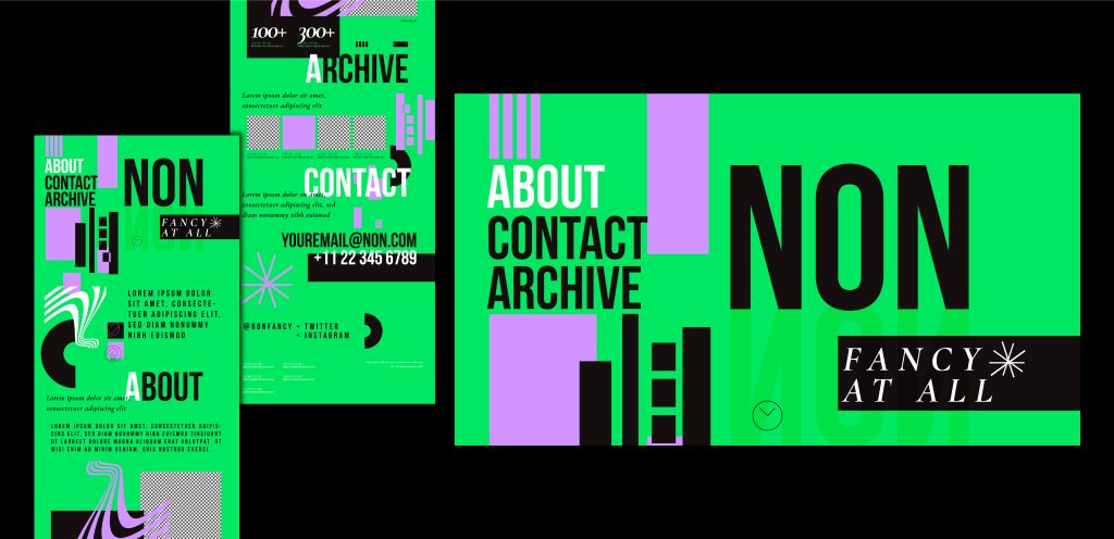
Bold and Experimental: Unique and unconventional typography that stands out on the shelf.
Impact of Typography Trends on Packaging Design
Typography trends influence packaging design by setting the tone and aesthetic direction. A minimalist trend might lead to simple, elegant packaging, while bold and experimental typography could result in eye-catching, standout designs. Staying current with typography trends helps brands remain relevant and appealing to their target audience.
Typography and Brand Recognition
How Typography Enhances Brand Recognition
Consistent use of typography across all packaging and marketing materials enhances brand recognition. When consumers repeatedly see the same font style associated with a brand, it becomes a visual cue that reinforces brand identity. Over time, this consistency builds trust and loyalty.
Case Studies of Effective Typography in Brand Recognition
Case studies of brands like Nike, with its bold, uppercase font, or Tiffany & Co., with its elegant serif font, demonstrate how effective typography can lead to strong brand recognition. These brands have maintained consistency in their typography, making their packaging instantly recognizable and reinforcing their brand identity.
Fonts in Packaging Design
Popular Fonts Used in Packaging
Some popular fonts used in packaging design include:
Helvetica: Known for its clarity and neutrality.
Garamond: A classic serif font with a timeless appeal.
Futura: A geometric sans-serif font with a modern feel.
Bodoni: A serif font with a mix of thick and thin strokes, offering a sophisticated look.
Choosing the Right Font for Your Brand
Choosing the right font involves considering the brand’s personality, target audience, and the product itself. A luxury brand might choose a refined serif font, while a trendy, youthful brand might opt for a bold, sans-serif font. The font should align with the brand’s values and message while being functional and readable.
Creative Packaging Typography
Innovative Typography Techniques
Innovative typography techniques in packaging include:
Custom Fonts: Creating unique fonts tailored to the brand.
Layering Text: Using overlapping text for a dynamic effect.
Interactive Typography: Designing typography that interacts with packaging elements, such as opening flaps or revealing hidden messages.
Examples of Creative Typography in Packaging
Examples of creative typography in packaging can be seen in brands like Method, which uses playful, handwritten fonts, or Absolut Vodka, which has used a variety of experimental fonts in its limited edition bottles. These creative approaches make the packaging more engaging and memorable.
Typography in Product Packaging
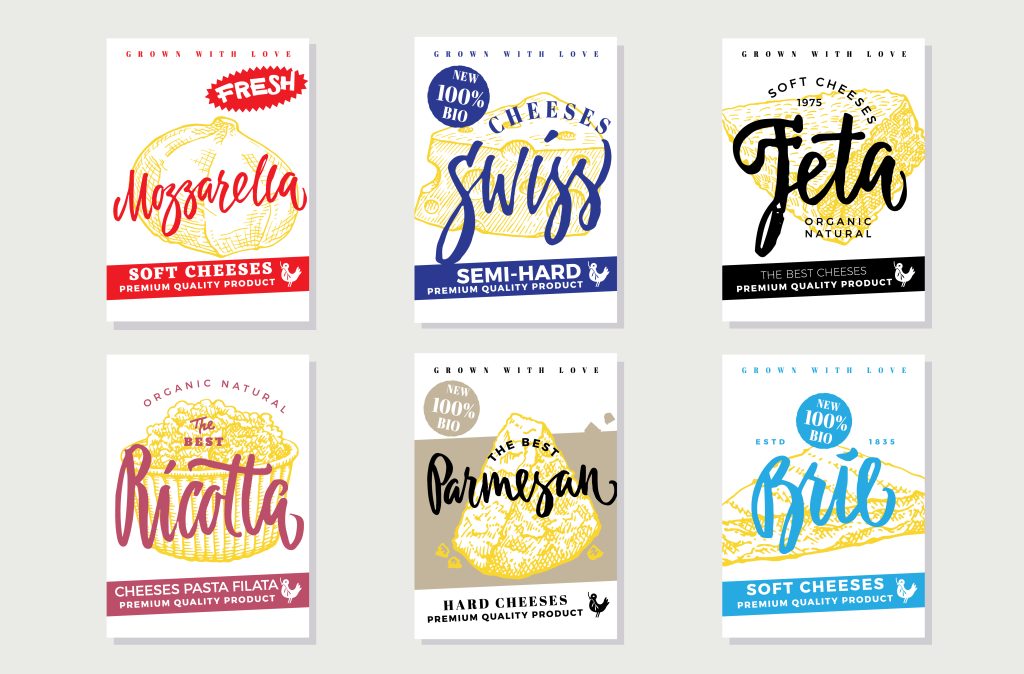
Specifics of Typography in Different Types of Packaging
Different types of packaging require different typographic considerations:
Food Packaging: Clear, readable fonts are essential for displaying ingredients and nutritional information.
Cosmetic Packaging: Often uses elegant, sophisticated fonts to convey luxury and quality.
Electronics Packaging: Typically employs modern, clean fonts to suggest innovation and technology.
Typography in Food Packaging, Cosmetic Packaging, and More
In food packaging, typography must balance readability with branding. For cosmetic packaging, the focus is often on creating a premium feel through font choice and layout. Electronics packaging uses typography to communicate product features and technical specifications clearly.
Typography Choices in Packaging
Factors to Consider When Choosing Typography
Factors to consider when choosing typography for packaging include:
Brand Personality: The font should reflect the brand’s character.
Target Audience: Different demographics respond to different font styles.
Product Type: The typography should suit the product’s nature and use.
Readability: The text should be easy to read at various sizes.
Balancing Aesthetic and Functional Typography
Balancing aesthetic and functional typography involves ensuring that the font is visually appealing while remaining readable and legible. This balance is crucial for effective packaging design, as it ensures that the packaging is both attractive and informative.
Effective Packaging Typography
Techniques for Effective Typography
Effective typography techniques include:
Hierarchy: Using different font sizes and weights to create a clear information hierarchy.
Alignment: Ensuring text is aligned for a clean, organized look.
Spacing: Adequate spacing between letters, words, and lines to enhance readability.
Contrast: Using contrasting colors to make text stand out.
Common Mistakes to Avoid
Common mistakes in packaging typography include:
Overcrowding: Too much text can make the packaging look cluttered.
Poor Contrast: Low contrast between text and background reduces readability.
Inconsistent Typography: Using too many different fonts can confuse the brand message.
Tiny Text: Text that is too small to read can frustrate consumers.
Typography Impact on Packaging
How Typography Influences Consumer Perception
Typography significantly influences consumer perception by conveying the brand’s message and tone. A well-chosen font can make a product appear more trustworthy, luxurious, or innovative. Conversely, poor typography can detract from the brand’s image and make the product less appealing.
Psychological Effects of Typography
Typography has psychological effects on consumers. For example, serif fonts are often perceived as more traditional and trustworthy, while sans-serif fonts are seen as modern and clean. The choice of typography can evoke emotions and influence purchasing decisions.
Brand Storytelling with Typography
Using Typography to Tell Your Brand’s Story
Typography can be used to tell a brand’s story by reflecting its values and personality. A handcrafted font might suggest artisanal quality, while a sleek, modern font could imply innovation. The typography should align with the brand’s narrative and help convey its message effectively.
Examples of Storytelling Through Typography
Examples of storytelling through typography include brands like Innocent Drinks, which uses playful, handwritten fonts to convey a fun, approachable personality, or Patagonia, which uses bold, straightforward typography to communicate its commitment to environmental activism.
Brand Identity Through Typography
Building Brand Identity with Typography
Building brand identity with typography involves choosing fonts that reflect the brand’s values and character. Consistent use of these fonts across all packaging and marketing materials reinforces the brand identity and makes it more recognizable to consumers.
Case Studies of Strong Brand Identities Created by Typography
Case studies of strong brand identities created by typography include brands like Coca-Cola, with its instantly recognizable script font, and Google, which has evolved its typography over time to reflect its growth and innovation while maintaining a consistent brand identity.
Packaging Design Elements
Integrating Typography with Other Design Elements
Integrating typography with other design elements, such as images, colors, and shapes, creates a cohesive and harmonious packaging design. The typography should complement these elements, enhancing the overall visual appeal and communication of the packaging.
Balance and Harmony in Packaging Design
Achieving balance and harmony in packaging design involves ensuring that all design elements, including typography, work together to create a unified and attractive package. This balance makes the packaging more effective in conveying the brand’s message and appealing to consumers.
Challenges and Solutions in Typography for Packaging
Common Typography Challenges
Common challenges in typography for packaging include:
Ensuring Readability at Small Sizes: Packaging often has limited space, making small text a necessity.
Maintaining Consistency Across Products: Consistency is key to brand recognition, but can be challenging with multiple products.
Balancing Aesthetics and Functionality: Creating visually appealing yet readable typography.
Solutions and Best Practices
Solutions and best practices for typography challenges include:
Using High-Quality Fonts: Quality fonts ensure clarity at small sizes.
Establishing Brand Guidelines: Clear guidelines maintain consistency across products.
Testing Typography: Regular testing ensures that typography remains effective and readable.
Future Trends in Typography for Packaging
Emerging Trends in Typography
Emerging trends in typography include:
Variable Fonts: Allowing for greater flexibility and adaptability.
3D Typography: Adding depth and dimension to text.
Animated Typography: Dynamic text that can change and move.
Predictions for the Future of Typography in Packaging
Predictions for the future of typography in packaging suggest a continued blend of technology and design, with more interactive and personalized typography. Brands will increasingly use typography to create unique and engaging packaging experiences.
Expert Opinions on Typography in Packaging Design
Insights from Design Professionals
Design professionals emphasize the importance of choosing typography that aligns with the brand’s values and message. They also highlight the need for readability and consistency in creating effective packaging typography.
Quotes and Advice from Typography Experts
Quotes from typography experts like Massimo Vignelli, who said, “The life of a designer is a life of fight: fight against the ugliness,” underscore the importance of thoughtful, intentional typography in design. Their advice often centers on maintaining simplicity, clarity, and alignment with brand identity.
Conclusion
Summary of Key Points
In conclusion, typography plays a critical role in packaging design by communicating brand identity, enhancing readability, and influencing consumer perception. Key principles such as readability, legibility, and consistency are essential for effective typography. Current trends and future innovations continue to shape the way typography is used in packaging, making it a dynamic and evolving field.
Final Thoughts on Typography in Packaging Design
Typography is more than just a design element; it’s a powerful tool for storytelling and brand communication. By carefully choosing and implementing typography, brands can create memorable, engaging, and effective packaging that resonates with consumers.
Read More: The Art of Storytelling Through Packaging Design
FAQs
Q1: What is the role of typography in packaging design?
Ans: Typography in packaging design serves to communicate the brand’s identity, convey important information, and enhance the overall visual appeal of the packaging. It plays a crucial role in attracting consumers and making the product memorable.
Q2: How does typography affect brand identity?
Ans: Typography affects brand identity by reflecting the brand’s personality, values, and tone. Consistent use of typography across all branding materials helps create a cohesive and recognizable brand image.
Q3: What are the latest trends in packaging typography?
Ans: The latest trends in packaging typography include minimalism, handwritten fonts, vintage and retro styles, and bold, experimental typography. These trends influence the overall aesthetic and appeal of the packaging.
Q4: How do you choose the right font for packaging?
Ans: Choosing the right font for packaging involves considering the brand’s personality, target audience, product type, and readability. The font should align with the brand’s values and message while being functional and easy to read.
Q5: What are some common mistakes in packaging typography?
Ans: Common mistakes in packaging typography include overcrowding text, poor contrast, inconsistent typography, and using text that is too small to read. Avoiding these mistakes ensures that the typography is effective and enhances the overall packaging design.
GZScVuEJfiwjOnX
Your article helped me a lot, is there any more related content? Thanks!
Can you be more specific about the content of your article? After reading it, I still have some doubts. Hope you can help me.
Your article helped me a lot, is there any more related content? Thanks!
Thank you for your sharing. I am worried that I lack creative ideas. It is your article that makes me full of hope. Thank you. But, I have a question, can you help me?
Thank you for your sharing. I am worried that I lack creative ideas. It is your article that makes me full of hope. Thank you. But, I have a question, can you help me?
Thank you for your sharing. I am worried that I lack creative ideas. It is your article that makes me full of hope. Thank you. But, I have a question, can you help me?
I don’t think the title of your article matches the content lol. Just kidding, mainly because I had some doubts after reading the article.
Can you be more specific about the content of your article? After reading it, I still have some doubts. Hope you can help me.
Can you be more specific about the content of your article? After reading it, I still have some doubts. Hope you can help me.
Thanks for sharing. I read many of your blog posts, cool, your blog is very good.
I don’t think the title of your article matches the content lol. Just kidding, mainly because I had some doubts after reading the article.
Thank you for your sharing. I am worried that I lack creative ideas. It is your article that makes me full of hope. Thank you. But, I have a question, can you help me?
Thank you for your sharing. I am worried that I lack creative ideas. It is your article that makes me full of hope. Thank you. But, I have a question, can you help me?
I’m extremely inspired with your writing skills and also with the layout for your blog. Is that this a paid theme or did you customize it your self? Either way stay up the nice high quality writing, it is rare to peer a great blog like this one nowadays!
I don’t think the title of your article matches the content lol. Just kidding, mainly because I had some doubts after reading the article.
биржа аккаунтов покупка аккаунтов
аккаунты с балансом маркетплейс аккаунтов
магазин аккаунтов https://magazin-akkauntov-online.ru/
маркетплейс для реселлеров https://ploshadka-prodazha-akkauntov.ru
магазин аккаунтов социальных сетей безопасная сделка аккаунтов
покупка аккаунтов продажа аккаунтов
покупка аккаунтов гарантия при продаже аккаунтов
Account Buying Platform Online Account Store
Gaming account marketplace Secure Account Purchasing Platform
Account Sale Sell Pre-made Account
Accounts market Profitable Account Sales
Database of Accounts for Sale Guaranteed Accounts
Account Buying Service Sell accounts
Account marketplace Accounts for Sale
Ready-Made Accounts for Sale Online Account Store
Account Market Account Sale
Buy Account Online Account Store
Buy Pre-made Account Account Buying Platform
social media account marketplace sell account
sell accounts find accounts for sale
account marketplace account market
account trading marketplace for ready-made accounts
profitable account sales database of accounts for sale
purchase ready-made accounts verified accounts for sale
buy account sell account
buy accounts gaming account marketplace
purchase ready-made accounts account catalog
account trading guaranteed accounts
account trading platform https://accounts-marketplace.org
secure account purchasing platform buy pre-made account
account exchange buy and sell accounts
account trading platform account trading service
account sale marketplace for ready-made accounts
sell pre-made account account marketplace
guaranteed accounts account buying platform
account market guaranteed accounts
online account store buy accounts
buy pre-made account profitable account sales
sell accounts account trading platform
account exchange buy accounts
guaranteed accounts ready-made accounts for sale
account trading service gaming account marketplace
guaranteed accounts sell account
database of accounts for sale verified accounts for sale
account trading platform website for buying accounts
buy account find accounts for sale
verified accounts for sale https://accounts-offer.org
account trading https://accounts-marketplace.xyz
account trading https://buy-best-accounts.org
accounts for sale https://social-accounts-marketplaces.live
database of accounts for sale https://accounts-marketplace.live
sell pre-made account https://social-accounts-marketplace.xyz/
account selling platform https://buy-accounts.space
online account store buy accounts
account purchase https://accounts-marketplace.art/
purchase ready-made accounts https://social-accounts-marketplace.live
website for selling accounts https://buy-accounts.live/
account catalog https://accounts-marketplace.online
guaranteed accounts account market
маркетплейс аккаунтов akkaunty-na-prodazhu.pro
продать аккаунт https://rynok-akkauntov.top/
купить аккаунт kupit-akkaunt.xyz
продажа аккаунтов akkaunt-magazin.online
биржа аккаунтов akkaunty-market.live
маркетплейс аккаунтов https://kupit-akkaunty-market.xyz
маркетплейс аккаунтов akkaunty-optom.live
покупка аккаунтов online-akkaunty-magazin.xyz
покупка аккаунтов https://akkaunty-dlya-prodazhi.pro
магазин аккаунтов kupit-akkaunt.online
Can you be more specific about the content of your article? After reading it, I still have some doubts. Hope you can help me.
buying fb accounts https://buy-adsaccounts.work
buy fb ads account https://buy-ad-accounts.click
buy facebook accounts https://buy-ad-account.top
facebook ad account for sale https://buy-ads-account.click
facebook ad account buy https://ad-account-buy.top
buy aged facebook ads account https://buy-ads-account.work
buying facebook account https://ad-account-for-sale.top/
buy facebook ad accounts https://buy-ad-account.click
buy facebook advertising accounts https://ad-accounts-for-sale.work
buy google adwords accounts https://buy-ads-account.top
buy verified google ads account https://buy-ads-accounts.click
facebook account sale https://buy-accounts.click
buy adwords account https://ads-account-for-sale.top
buy google ads threshold account https://ads-account-buy.work
google ads reseller https://buy-ads-invoice-account.top/
buy google ad threshold account google ads reseller
buy google ad account https://buy-ads-agency-account.top
buy google ads threshold accounts buy google ads invoice account
verified business manager for sale https://buy-business-manager.org
buy google adwords accounts https://ads-agency-account-buy.click
buy aged google ads accounts https://buy-verified-ads-account.work
buy verified facebook business manager account buy-business-manager-acc.org
buy facebook business managers https://buy-bm-account.org/
buy verified bm facebook https://buy-verified-business-manager-account.org
facebook verified business manager for sale buy-verified-business-manager.org
facebook business manager buy business-manager-for-sale.org
buy verified facebook business manager account https://buy-business-manager-verified.org
buy verified business manager facebook buy-bm.org
buy facebook business manager account verified business manager for sale
buy facebook verified business account https://buy-business-manager-accounts.org/
tiktok agency account for sale https://buy-tiktok-ads-account.org
tiktok ad accounts https://tiktok-ads-account-buy.org
buy tiktok ads accounts buy tiktok business account
tiktok ad accounts https://tiktok-agency-account-for-sale.org
tiktok ads account for sale https://buy-tiktok-ad-account.org
tiktok agency account for sale https://buy-tiktok-ads-accounts.org
tiktok ads agency account buy tiktok business account
buy tiktok ads account buy tiktok ads accounts
buy tiktok business account https://tiktok-ads-agency-account.org
Thank you for your sharing. I am worried that I lack creative ideas. It is your article that makes me full of hope. Thank you. But, I have a question, can you help me? https://accounts.binance.com/register?ref=P9L9FQKY
how can i get clomiphene no prescription how to buy clomid tablets can i get generic clomid without insurance order generic clomiphene online can you get generic clomid without a prescription can i order clomiphene pills buying cheap clomiphene
More articles like this would remedy the blogosphere richer.
This is the kind of delivery I find helpful.
azithromycin 250mg drug – order azithromycin 250mg without prescription order metronidazole 400mg generic
cost rybelsus 14 mg – buy cheap semaglutide cheap periactin
domperidone 10mg oral – motilium online buy cyclobenzaprine 15mg us
inderal 10mg uk – purchase clopidogrel generic buy methotrexate 5mg sale
amoxil pills – generic valsartan combivent 100mcg sale
azithromycin 500mg pills – buy zithromax 250mg pills bystolic 5mg for sale
augmentin 1000mg oral – atbioinfo acillin where to buy
buy nexium 20mg for sale – anexa mate buy generic esomeprazole
order medex generic – https://coumamide.com/ order cozaar online
mobic drug – https://moboxsin.com/ buy mobic tablets
buy deltasone 20mg generic – aprep lson order prednisone 20mg pills
cheap erectile dysfunction pill – buy ed pills no prescription buy ed meds online
purchase amoxicillin for sale – amoxil order cheap amoxil online
Thanks for sharing. I read many of your blog posts, cool, your blog is very good.
Thanks for sharing. I read many of your blog posts, cool, your blog is very good.
fluconazole cheap – click diflucan 100mg us